
Pearson (EdTech)
Led the design of a multi-modal drawer system for Pearson’s eText platform, unifying fragmented patterns into a scalable, reusable solution across web and native.
Role: Senior Product Designer
Timeline: 2025
Platform: Web + Native
Collaborators: PMs, Engineers, Design Systems Team
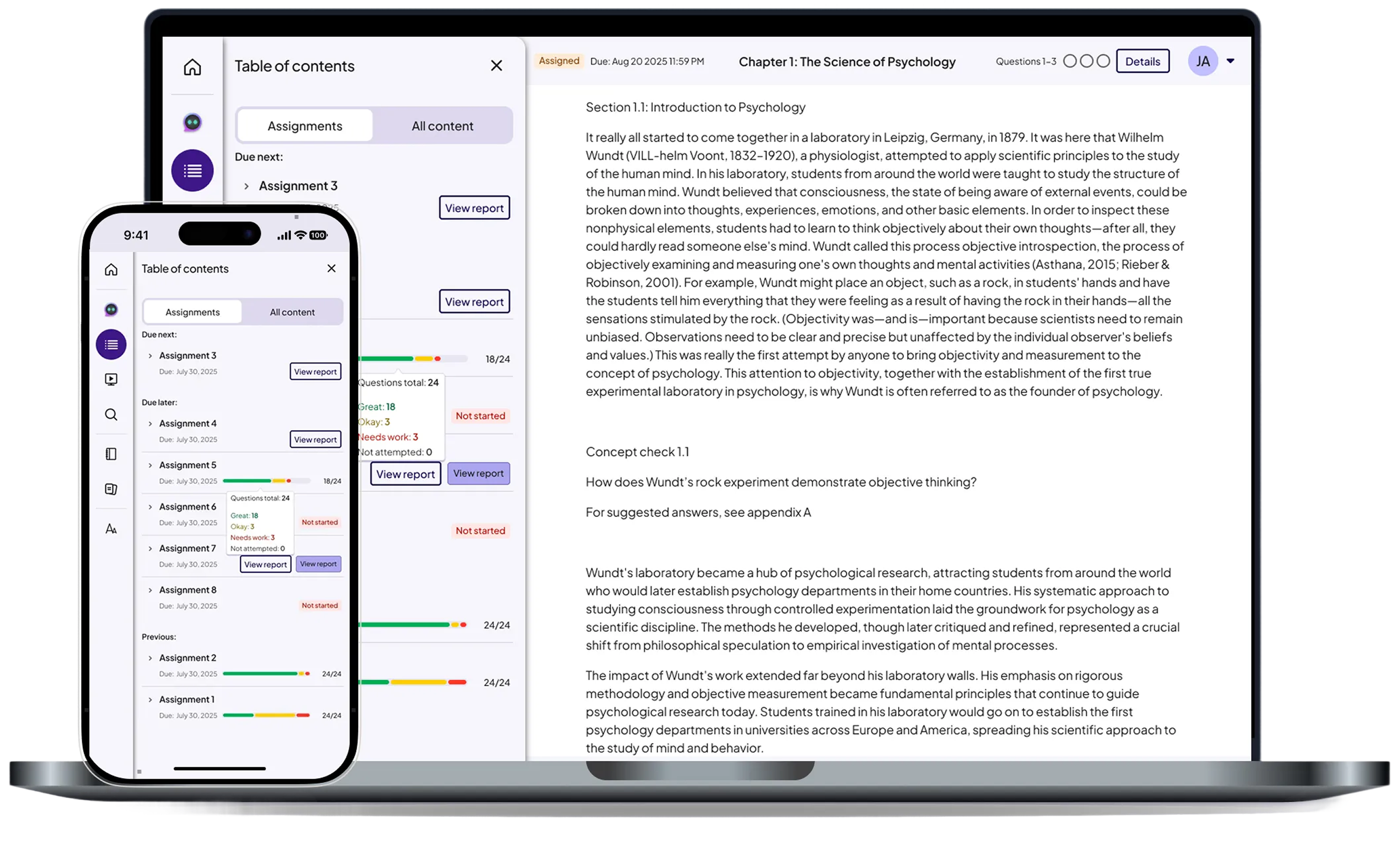
Assignable eText AeT is Pearson’s core reading and assessment platform, used daily by students and educators. Multiple drawers and task surfaces existed across the product, but lacked consistency, accessibility, and scalability across themes and platforms.
The experience also created friction between web and native implementations, making component behavior difficult to standardize and maintain.
I led the effort to unify these fragmented patterns into a reusable multi-modal drawer system designed to scale across experiences, themes, and platforms.
Before this work, AeT drawers suffered from:
• Different layouts and interaction patterns
• Components that didn’t adapt correctly in light, dark, or sepia
• Contrast failures in Sepia Mode
• Unclear flows and heavy cognitive load
• Mismatched web vs native behavior
This resulted in a fragmented user experience that didn’t scale for future features or themes.
Built a single drawer framework that supports reading, tasks, and AI across web and native
Optimized for theme scalability first, not one-off screens
Prioritized consistency and cognitive clarity over visual novelty
Designed patterns to be reusable across future Pearson products
To standardize drawer behavior across AeT, I defined scalable patterns that balanced flexibility, consistency, and cross-platform usability.
Defined a consistent structure for drawers that could support multiple content types while reducing fragmentation across the platform
Created a multi-modal system that could adapt to different contexts, including navigation, tasks, and supporting content without introducing new patterns
Aligned behavior, layout, and interactions across web and native while accounting for platform-specific constraints
• AI Drawer
• Summary Drawer
• Practice Drawer
• Explain Drawer
• Study Prep Drawer
• Search Drawer
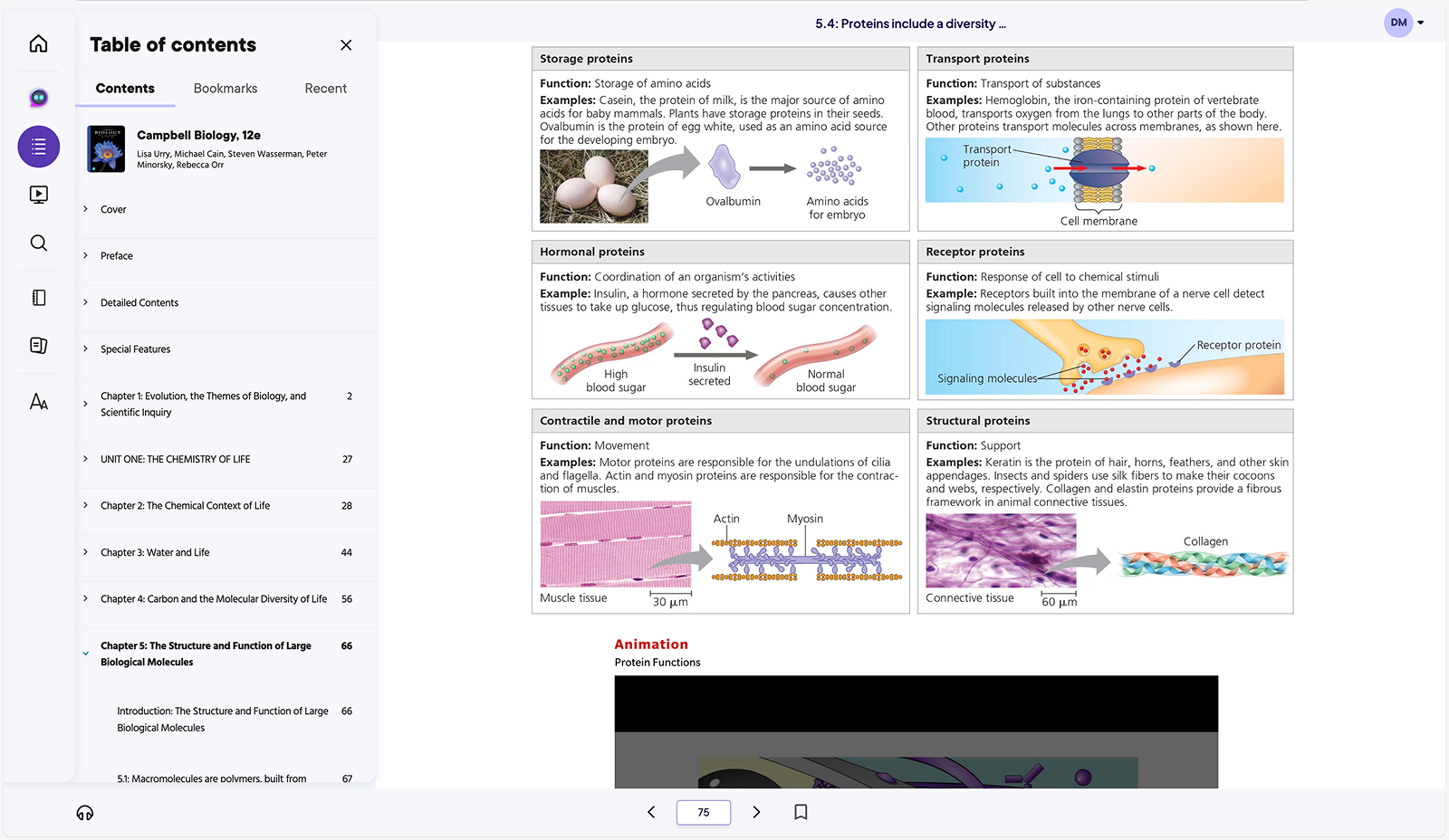
• Table of Contents Drawer
• Notebook Drawer
• Unified hierarchy and spacing
• Aligned components with design system tokens
• Clarified actions and navigation
• Matched web and native variations
• Ensured drawer content flowed consistently across screen sizes
Across all drawers, I improved:
• Question layouts and spacing
• Feedback and correctness states
• Icon usage
• Progress indicators
• Pressed, active, and loading states
• Empty and error states
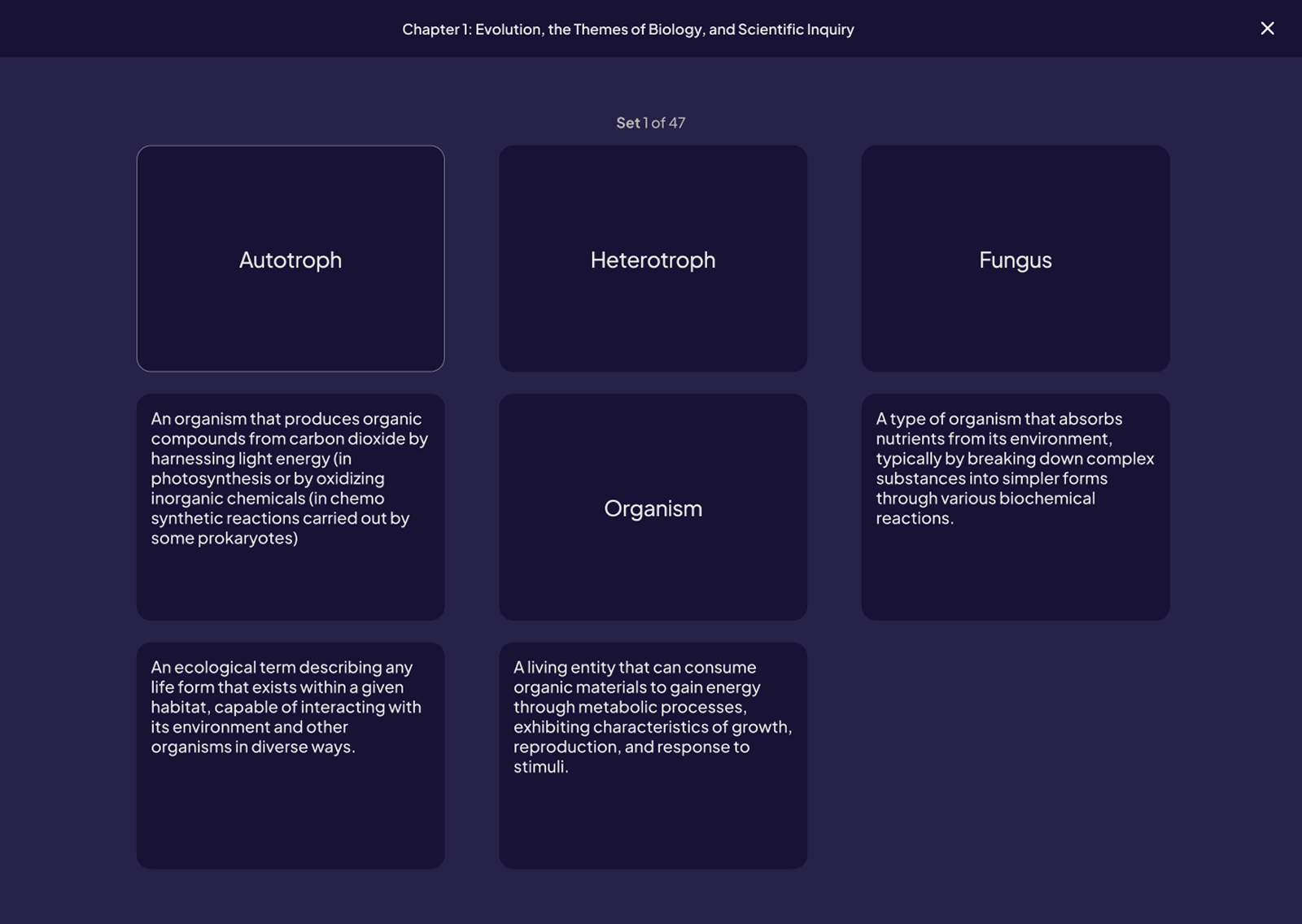
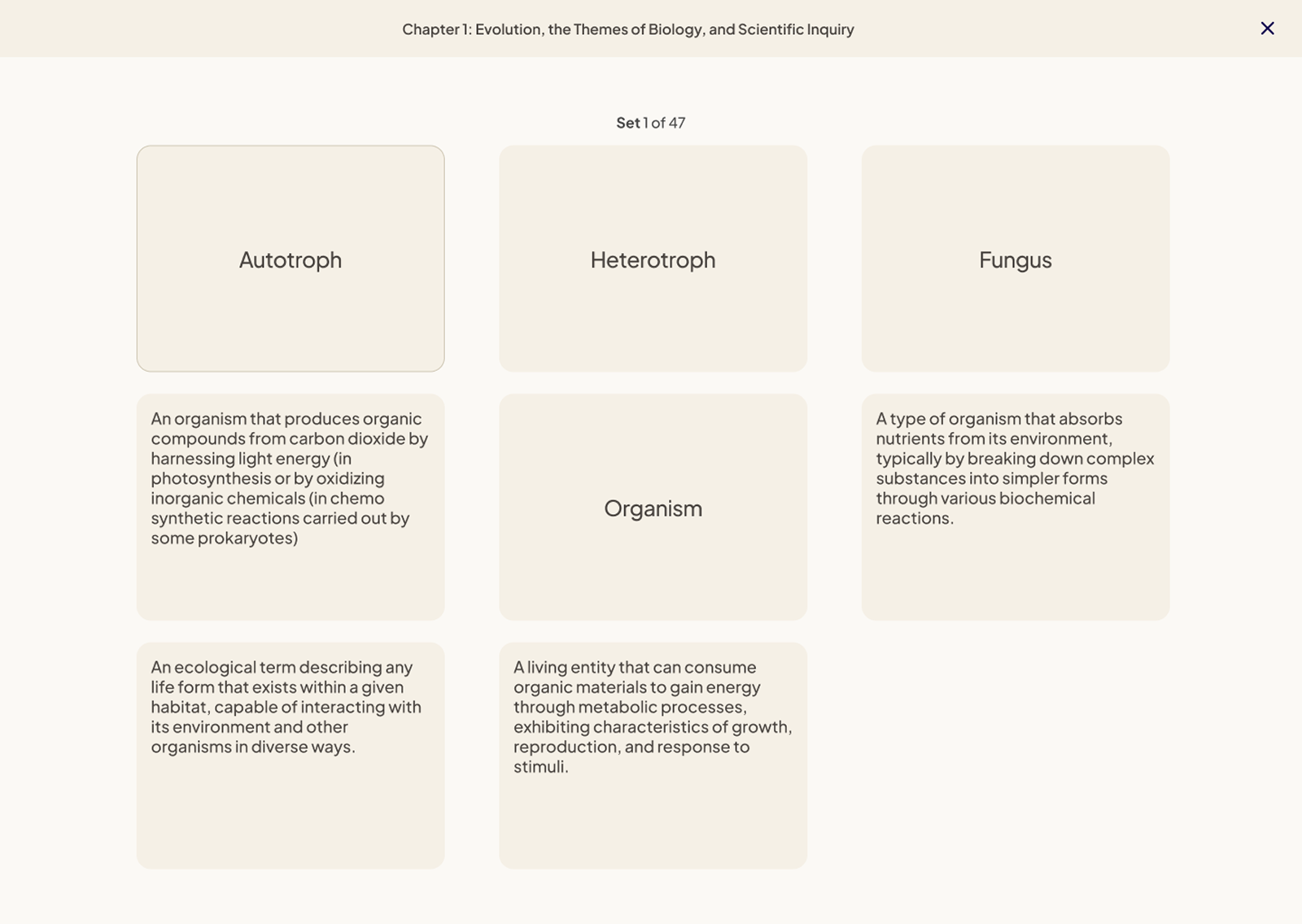
Visuals
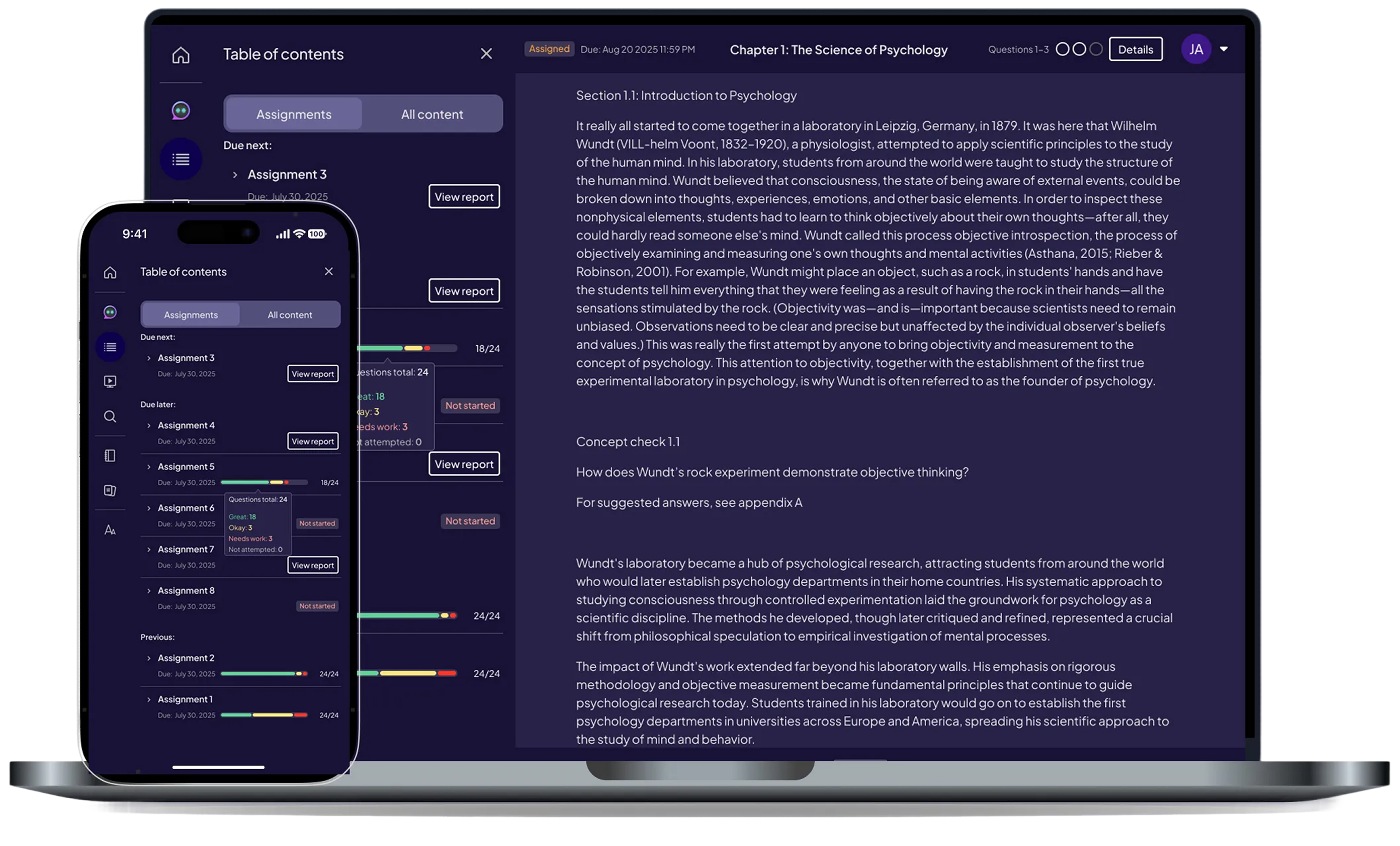
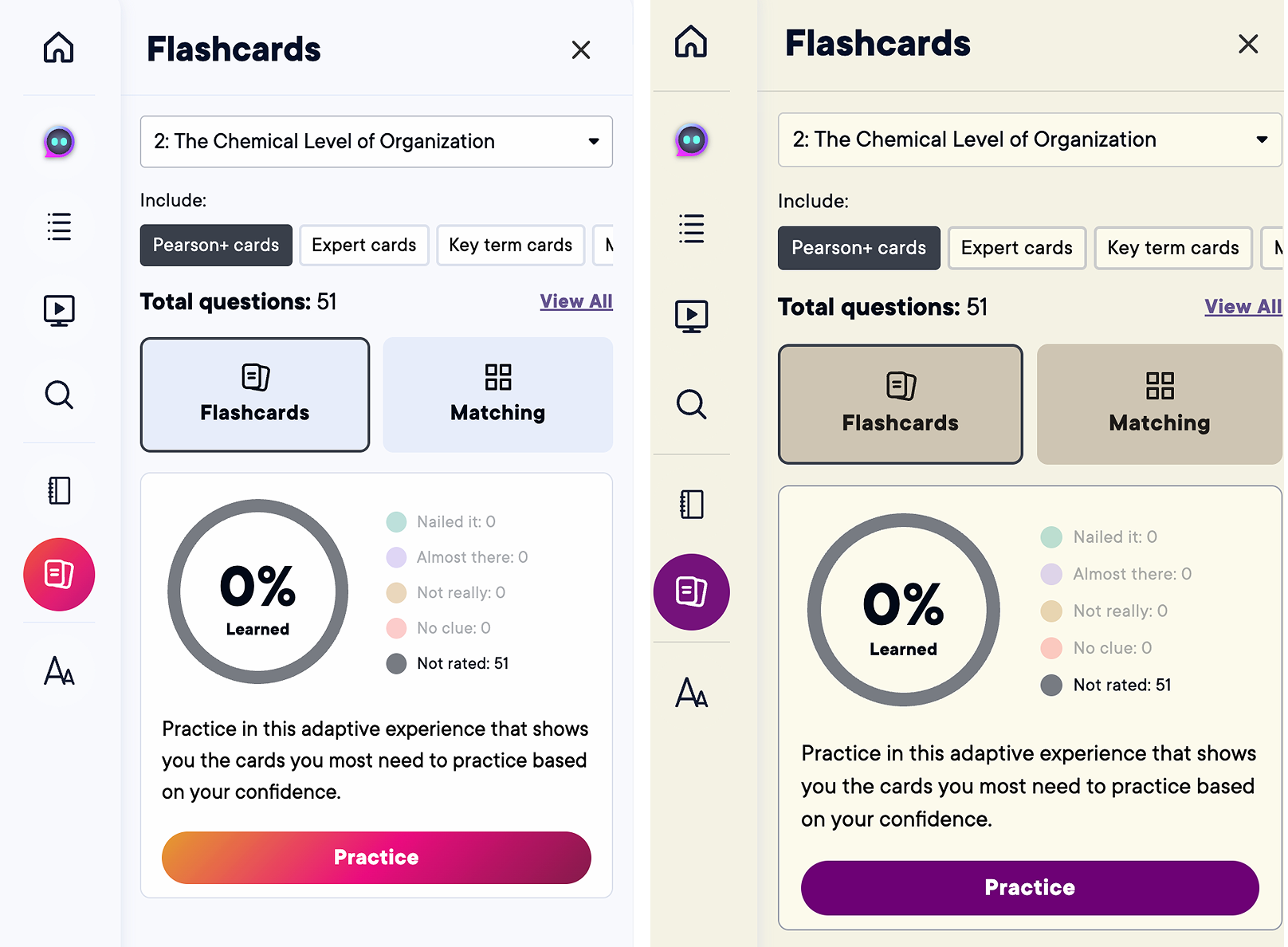
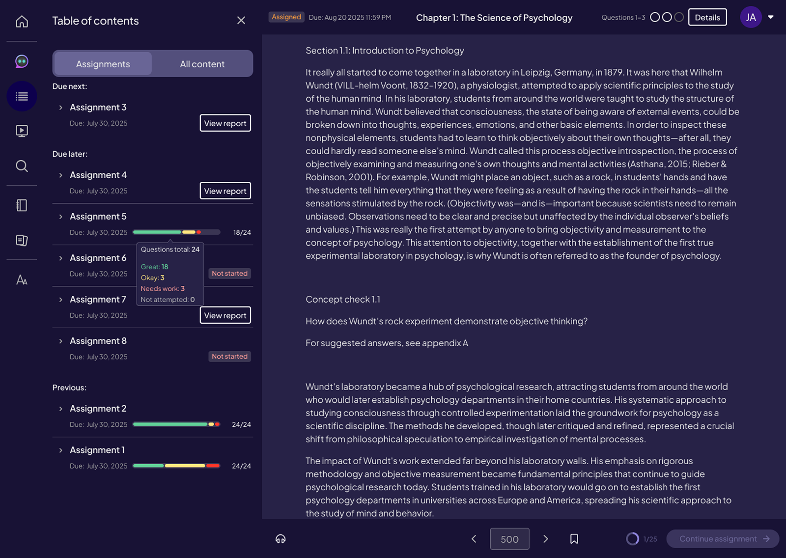
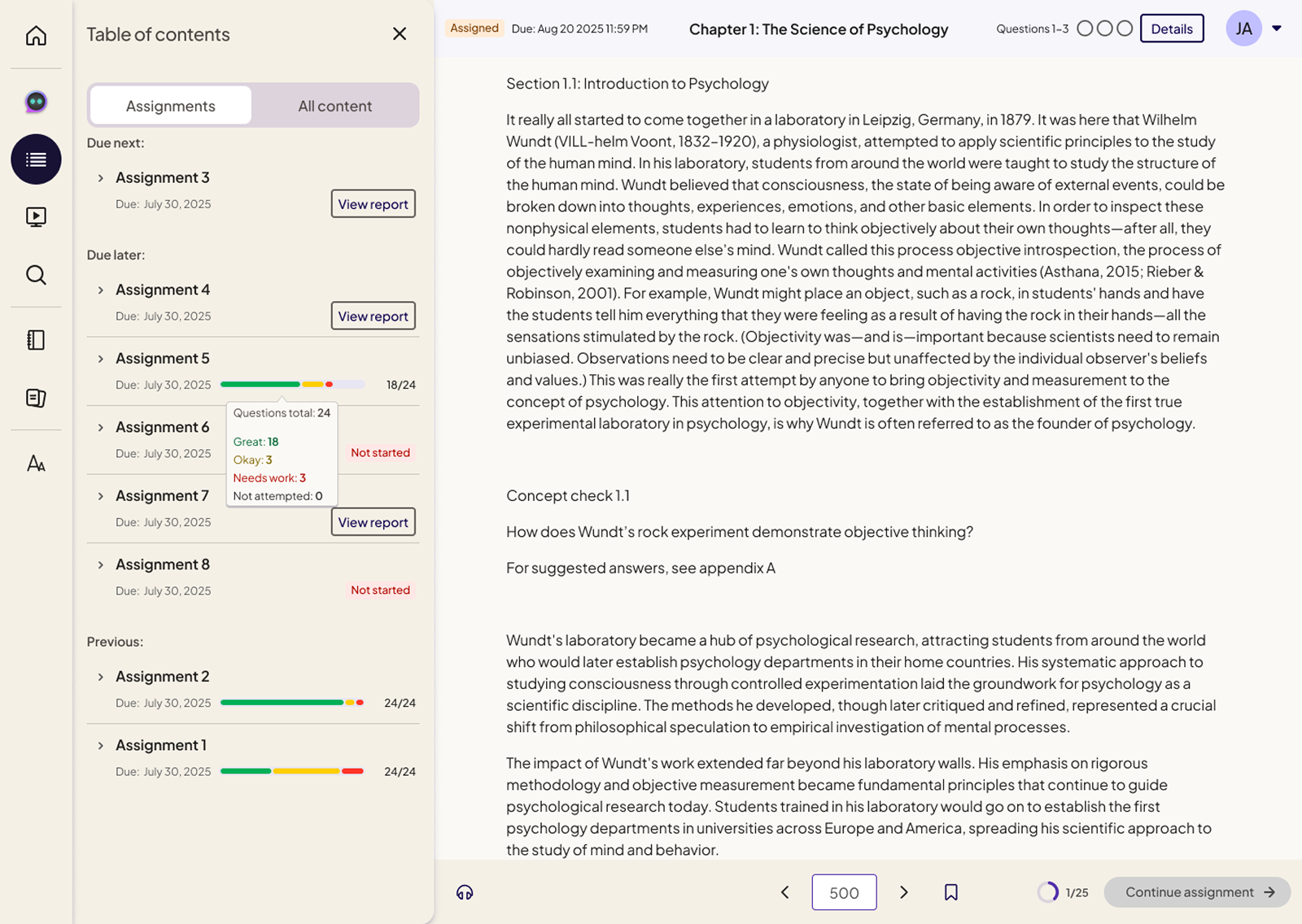
This section highlights the final desktop drawer designs across light, dark, and sepia modes, showing how a single drawer system supports multiple learning contexts including reading, study prep, search, notebooks, and flashcards. Visuals emphasize consistent layout, hierarchy, and interaction patterns across all core drawers.
Table of Contents (Light, Dark, Sepia)


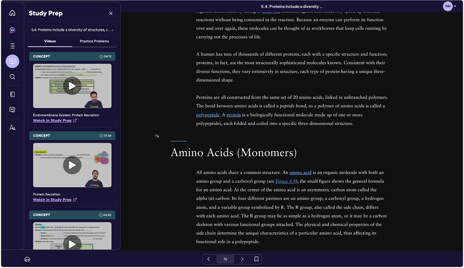
Study Prep (Light, Dark, Sepia)


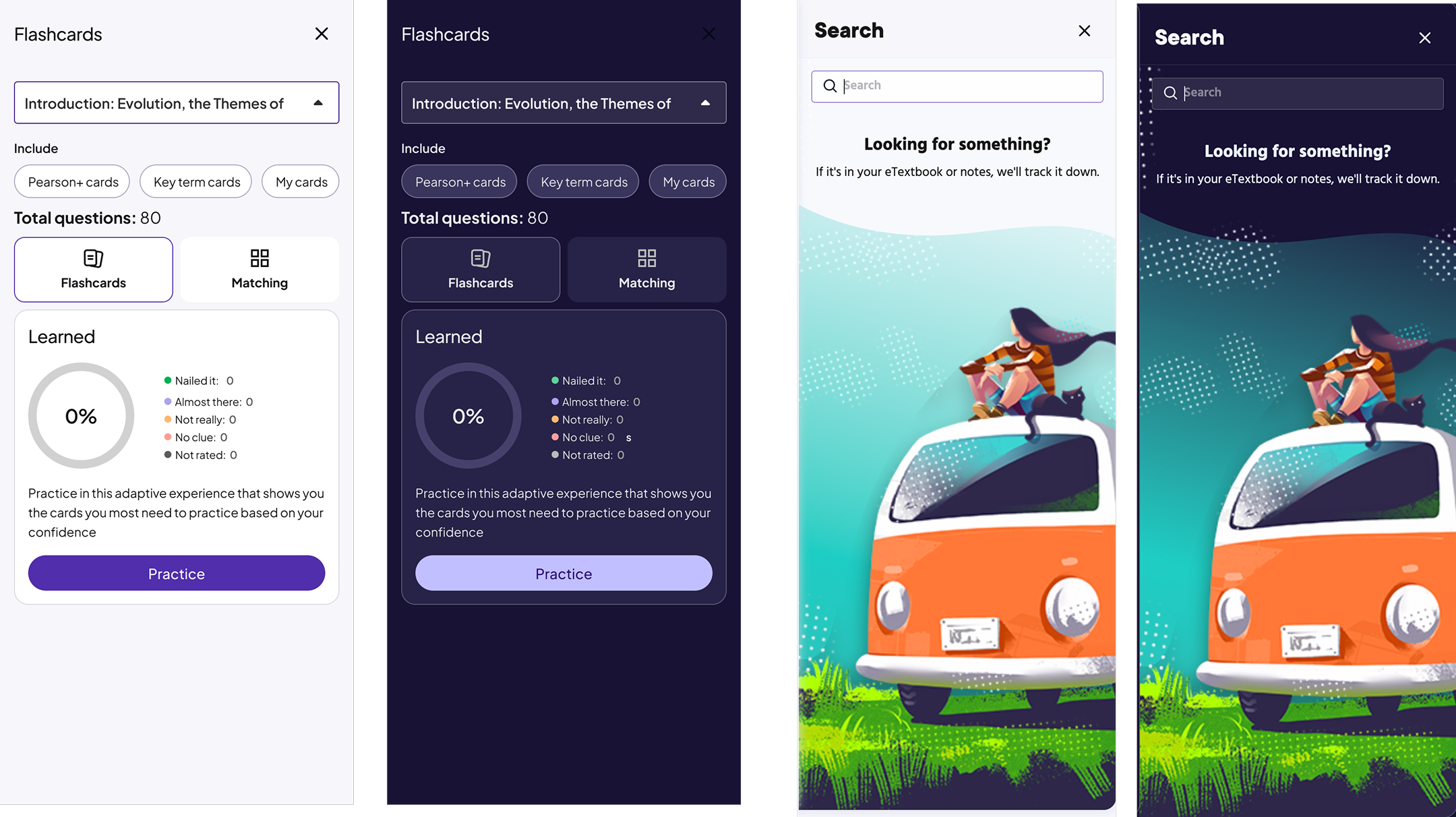
Flashcards (Light, Dark, Sepia)


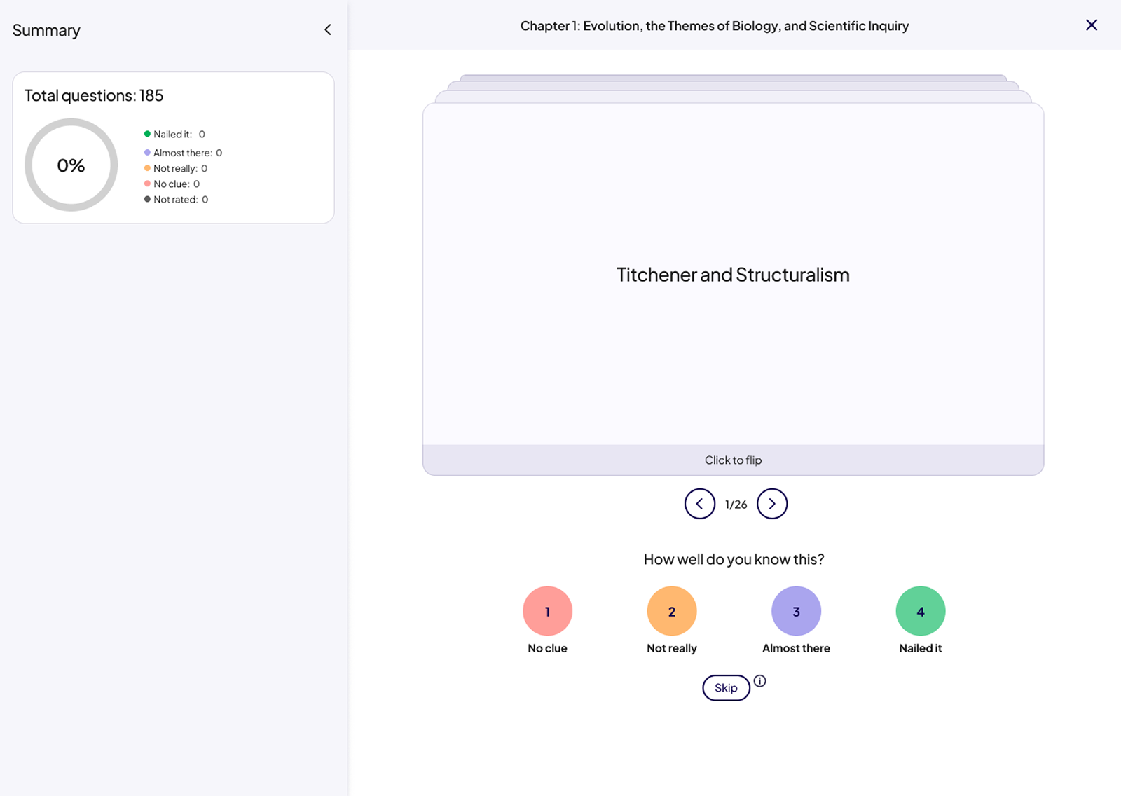
States
These examples demonstrate how the drawer system supports key states across learning workflows, including default, loading, empty, error, correct, and incorrect states. Each state was designed to provide clear feedback, reduce cognitive load, and maintain visual consistency across themes and platforms.
Defined and validated success, error, loading, and empty states across all drawer types.
Missing or inconsistent states created uncertainty during study and assessment flows.
Clear feedback, reduced confusion, and more confident student interactions.
Study Prep (Light, Dark, Sepia)
Empty progress state & Search empty (Light, Dark, Sepia)
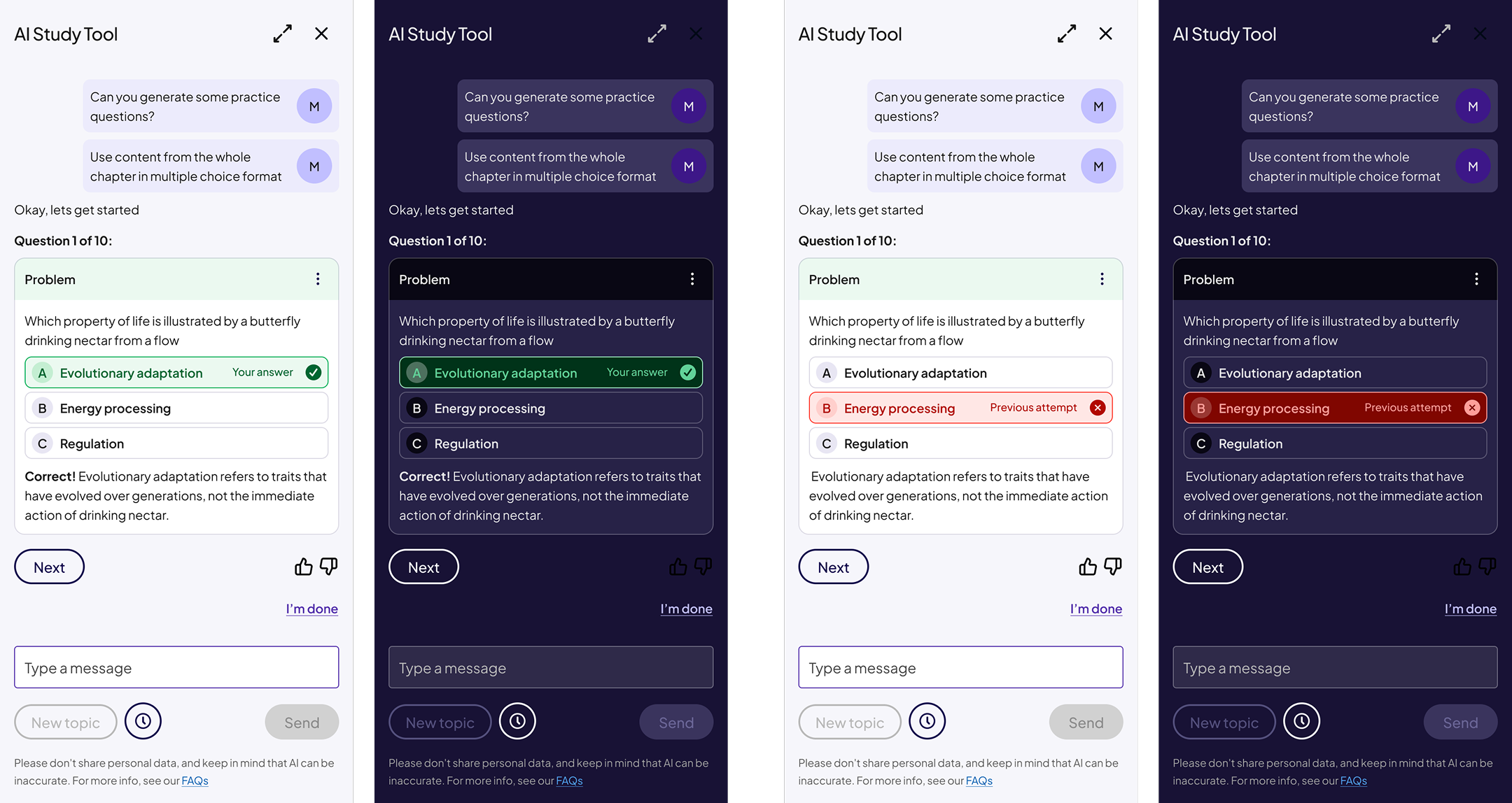
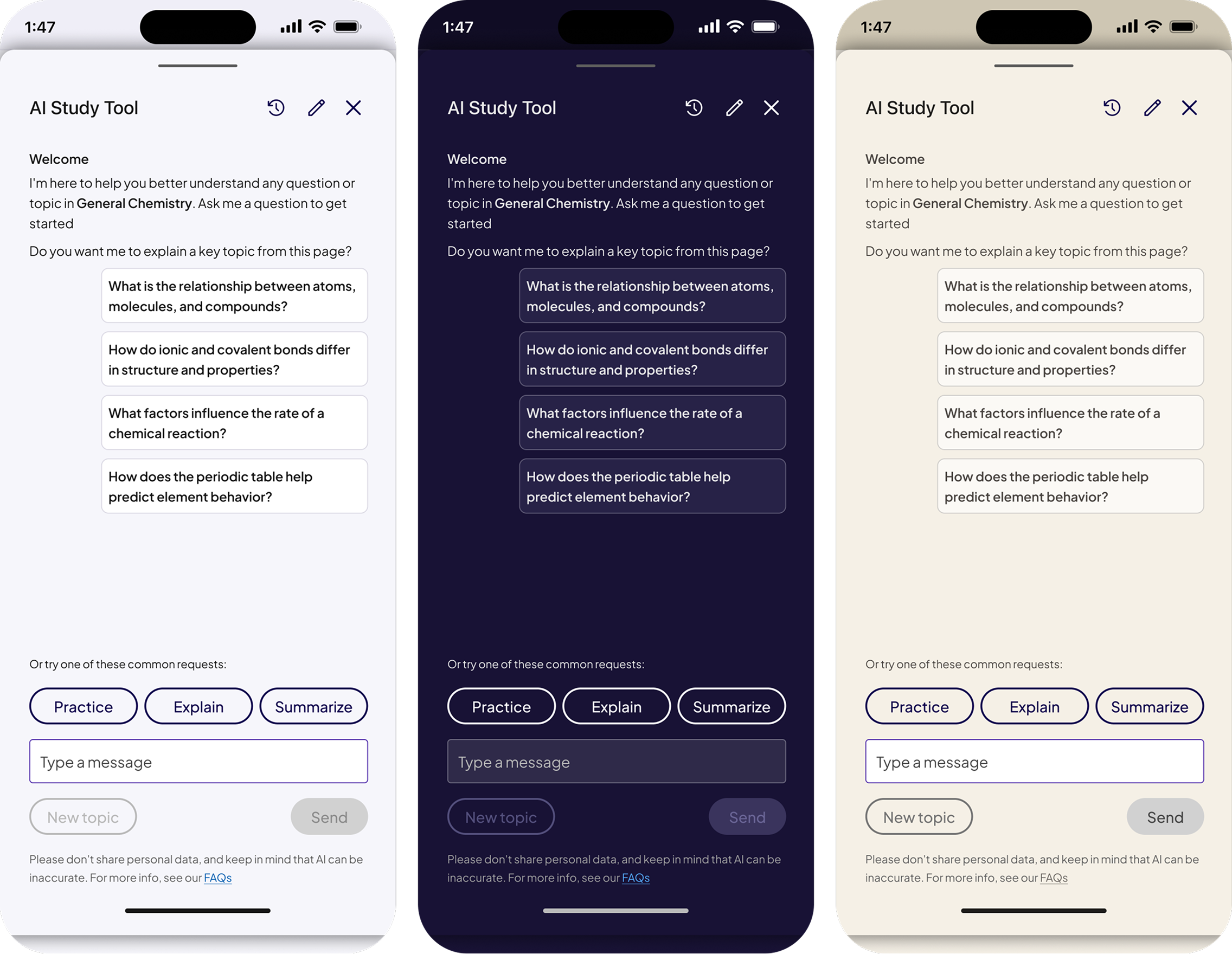
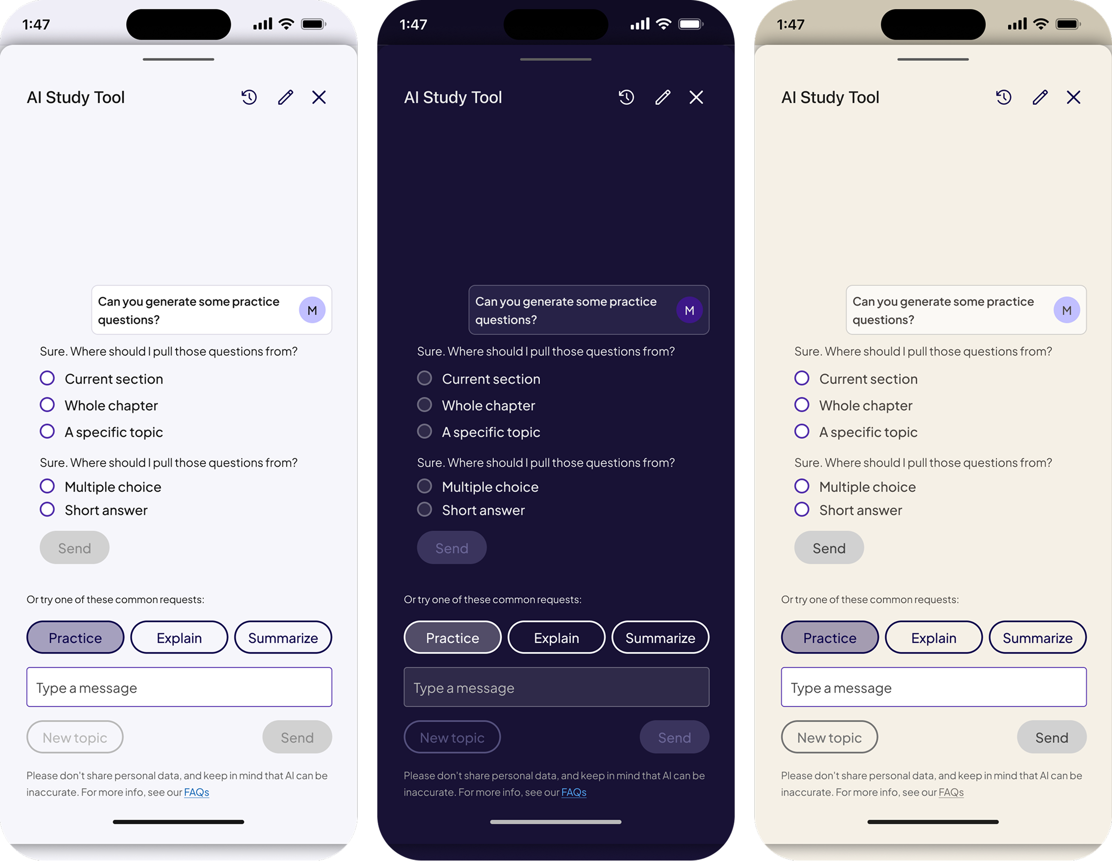
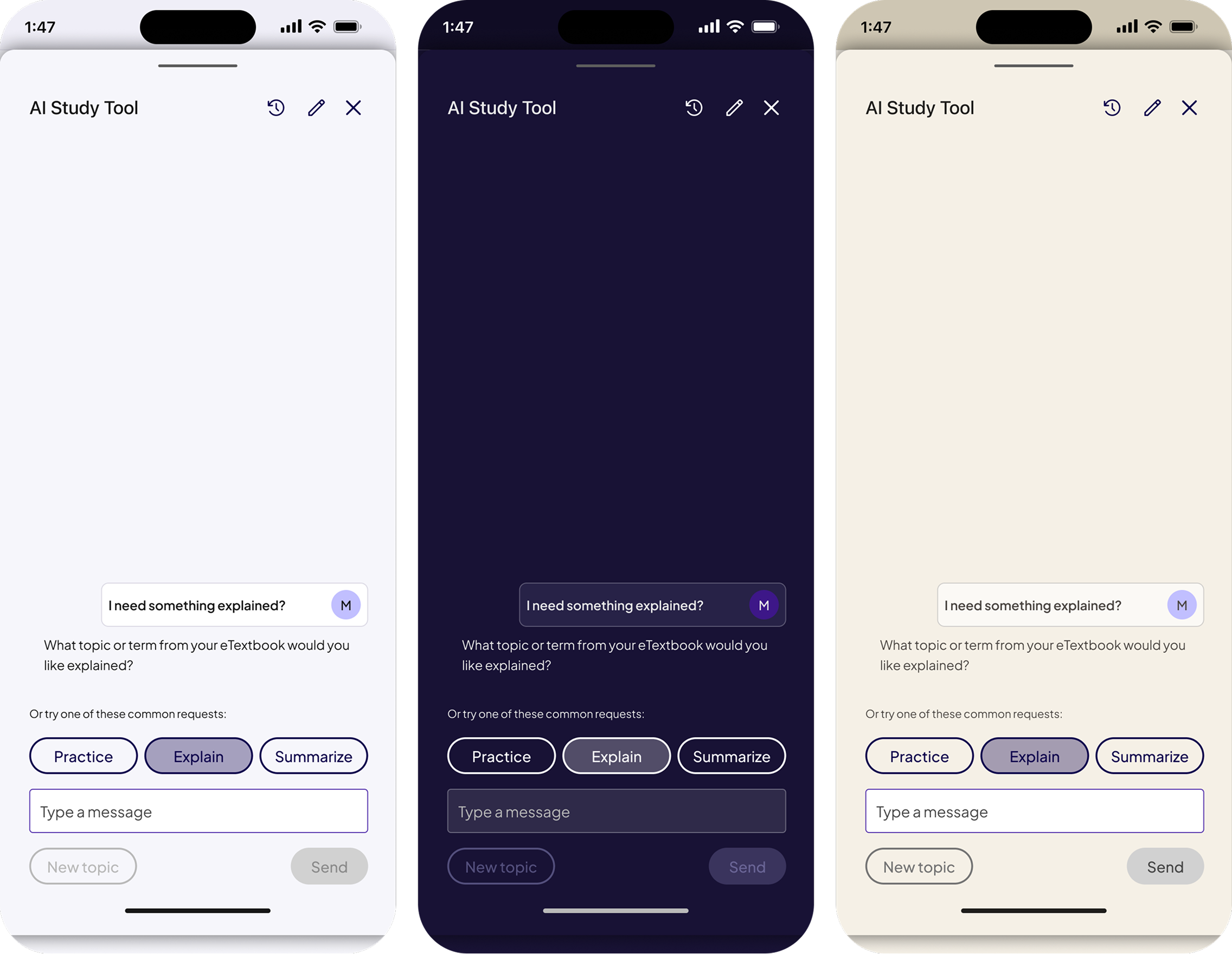
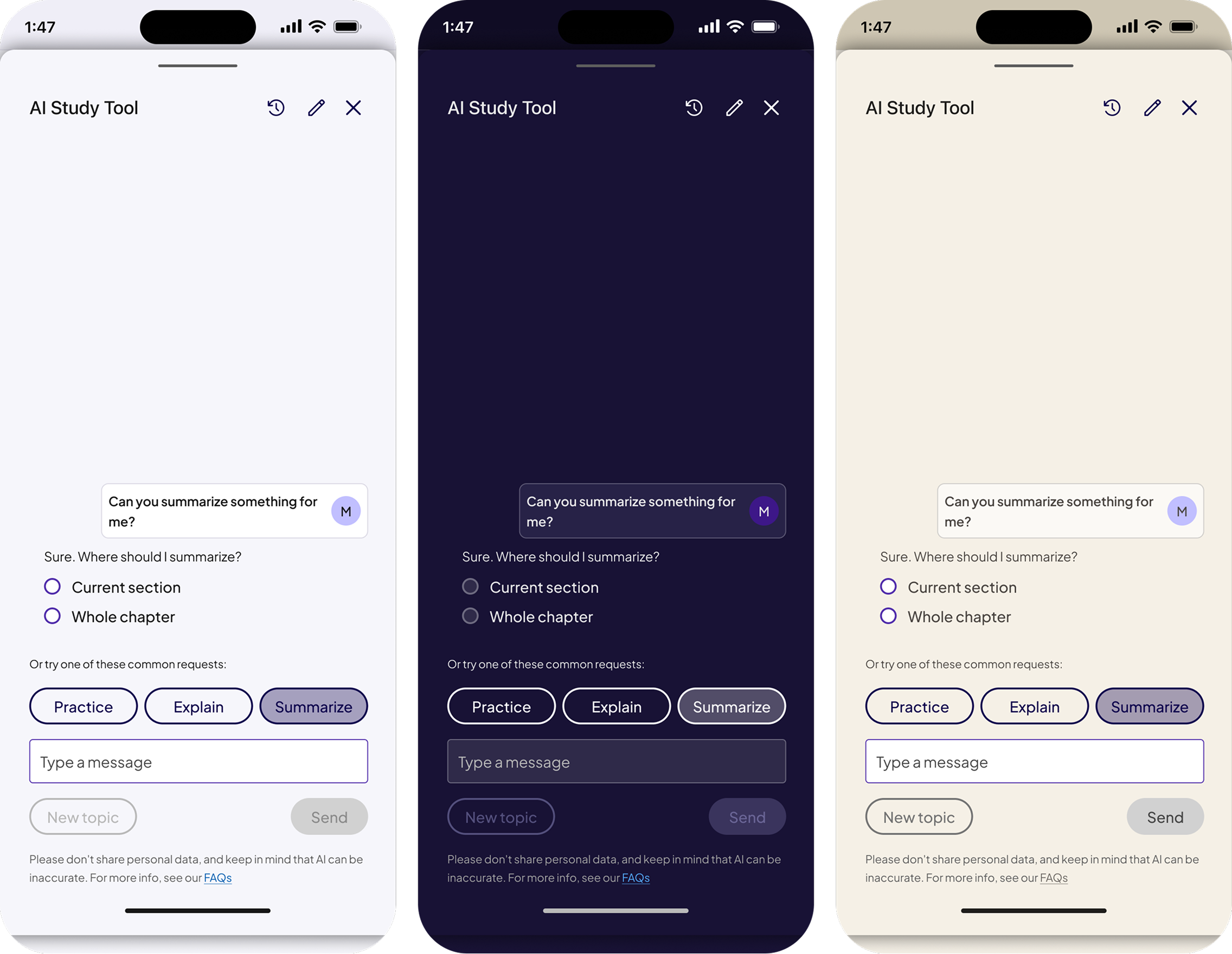
AI Drawer (Native first)
The AI Study Tool drawer was designed as a native first experience, built on the same drawer anatomy and design tokens as web. This allowed AI powered study support to feel integrated rather than bolted on, while ensuring consistency across light, dark, and sepia modes in mobile environments.
Designed the AI Study Tool as a native first drawer built on the same structural system.
AI features needed to feel integrated, not bolted on, especially in mobile contexts.
A scalable AI pattern that feels consistent with core AeT experiences across platforms.
AI Study Tool Default(Light, Dark, Sepia)
AI Study Tool Practice (Light, Dark, Sepia)
AI Study Tool Explain (Light, Dark, Sepia)
AI Study Tool Summarize (Light, Dark, Sepia)
This work focused on making drawers fully theme aware and accessible across light, dark, and sepia modes. Improvements included refined color palettes for readability, corrected semantic token usage, consistent contrast for text and surfaces, and validated interaction states to support inclusive learning experiences.
• Palette values for readability
• Contrast for text, borders, and surfaces
• Semantically correct tokens for interactive vs non-interactive elements
• State behavior validation across all modes
• Flashcards
• Matching tasks
• Reading views
• Study prep modules
• Drawers and sub-screens
Made all drawers fully theme aware using semantic tokens across light, dark, and sepia modes.
Previous components did not adapt correctly, especially in Sepia Mode.
Accessible contrast, readable surfaces, and consistent behavior across all themes.
Matching (Light, Dark, Sepia)
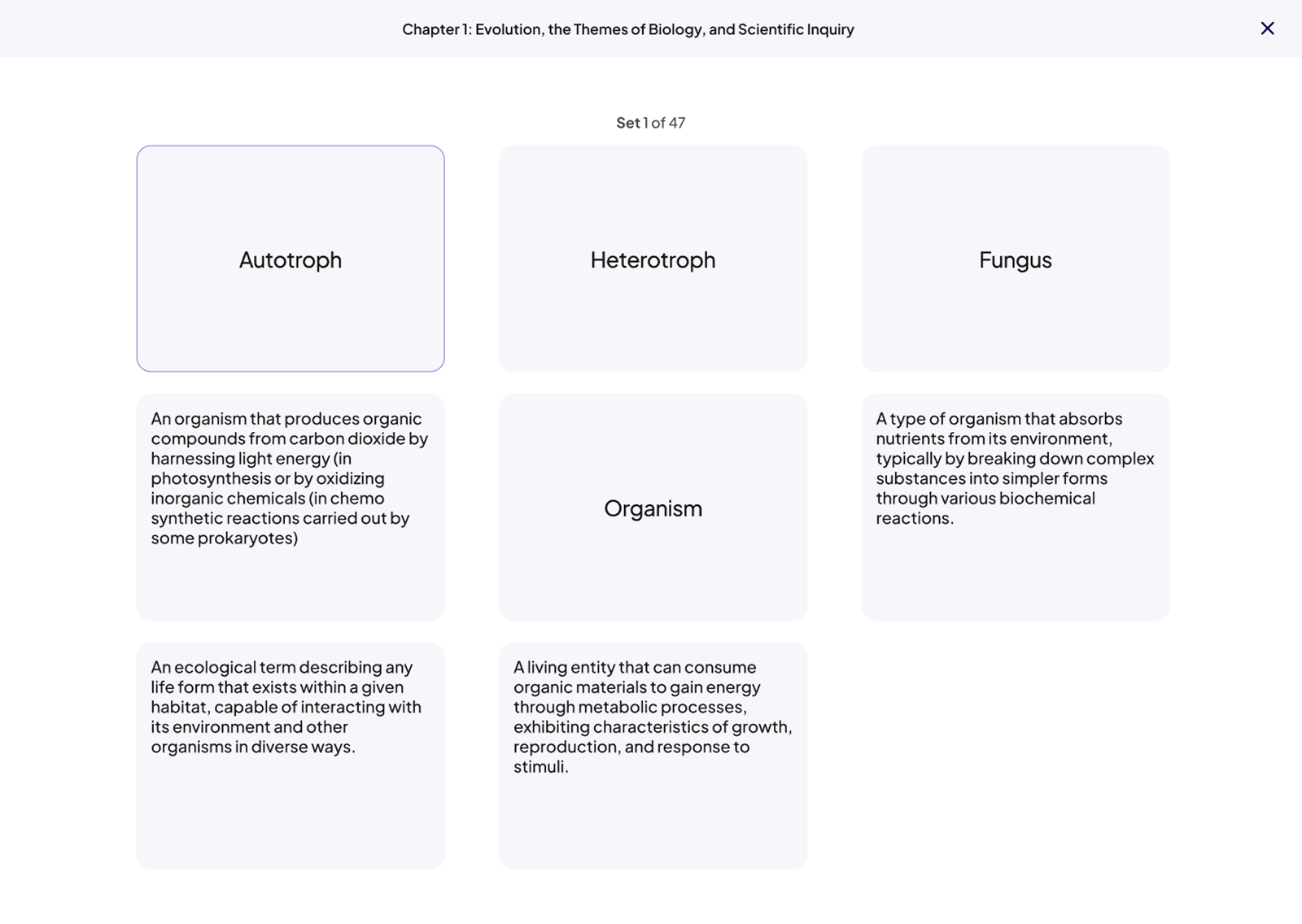
Flashcards (Light, Dark, Sepia)
.png)
.png)
Table of content (Light, Dark, Sepia)
• A calmer, more readable Sepia experience
• Clearer task structure within drawers
• Easier navigation with consistent patterns
• Better hierarchy that reduces cognitive load
• Unified drawer patterns across the entire product
• Reduced design and development inconsistencies
• Theme-ready components for future features and modes
• Strengthened semantic themed tokens
• Foundation for future theme variants
• Components reused by other Pearson teams
• Clear documentation for spacing, hierarchy, and interaction behavior
These outcomes were driven by system-level decisions focused on consistency, scalability, and accessibility rather than individual screen optimizations.
The drawer system is now in production and serves as the standard framework for AeT reading and task experiences. These designs established a consistent, theme aware drawer pattern across web and native, and enabled the successful rollout of Sepia Mode while laying the foundation for future theme expansion across Pearson apps and web.
• Scale the drawer system across additional learning and assessment experiences
• Explore AI-driven study support within drawer surfaces
• Advance accessibility through continuous audits and student feedback, with a focus on contrast, focus states, and assistive technology
Gordan Food service (B2B eCommerce)
Improving product discovery and ordering efficiency through smarter autocomplete, filtering, and scalable search patterns.
%20(1).png)
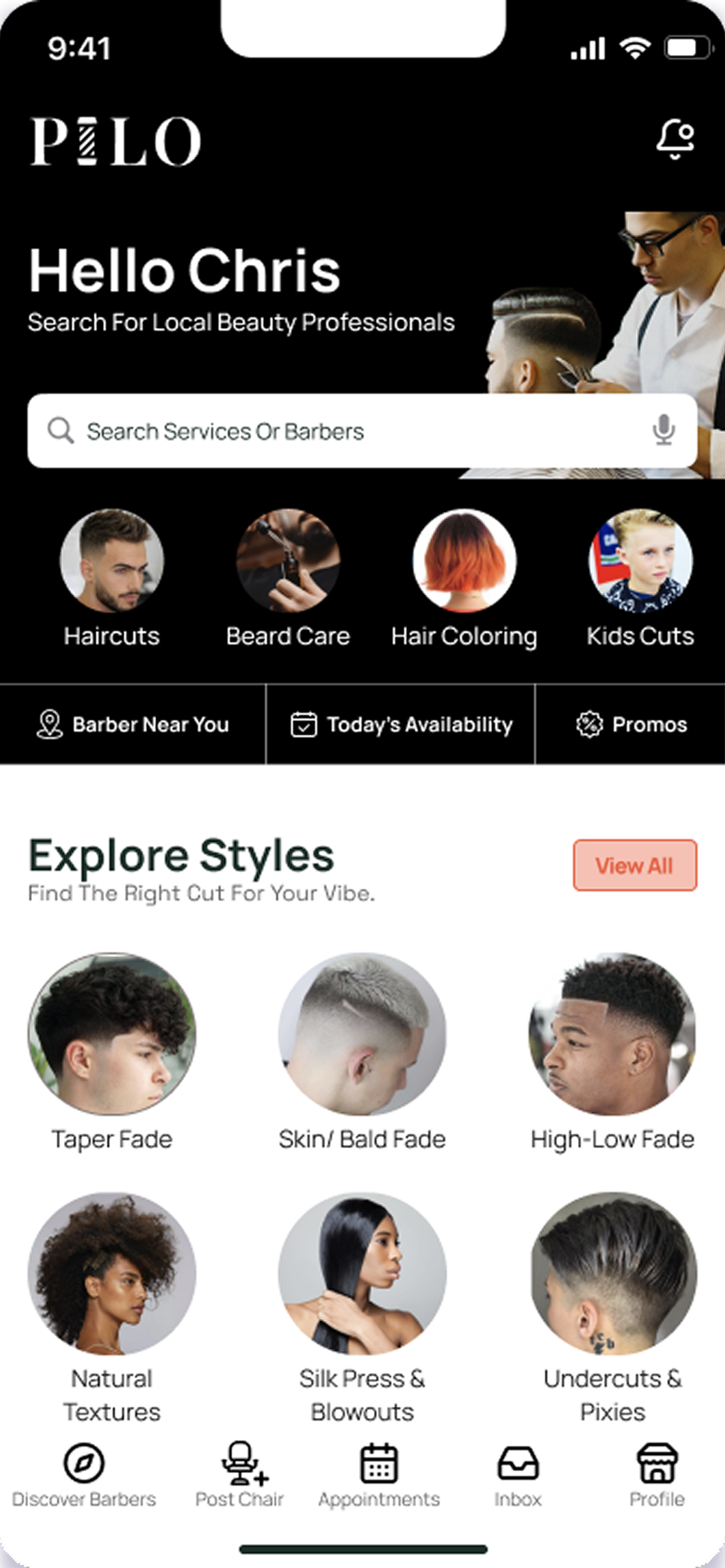
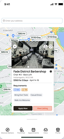
Pilo (Marketplace)
A mobile marketplace connecting licensed barbers with shops that need last-minute staffing.
© 2026 Dandrew Merriweather | Designed + Built by Dandrew