
Gordan Food service (B2B eCommerce)
Improving product discovery and ordering efficiency through smarter autocomplete, filtering, and scalable search patterns.
Role: Senior Product Designer + Implementation Engineer
Timeline: 2024
Platform: Web + Mobile
Collaborators: Product Managers, Engineers, Ordering Team
Search is one of the highest-traffic features in Gordon Food Service’s B2B ordering platform. However, the original experience lacked intelligence, consistency, and flexibility, leading to missed product discovery, slower ordering, and user frustration.
The experience struggled with autocomplete relevance, filtering behaviors, and responsive usability across high-frequency ordering workflows.
I led the redesign of search across web and app, introducing smarter autocomplete, improved filtering, and reusable search components integrated into the GFS Design Library.
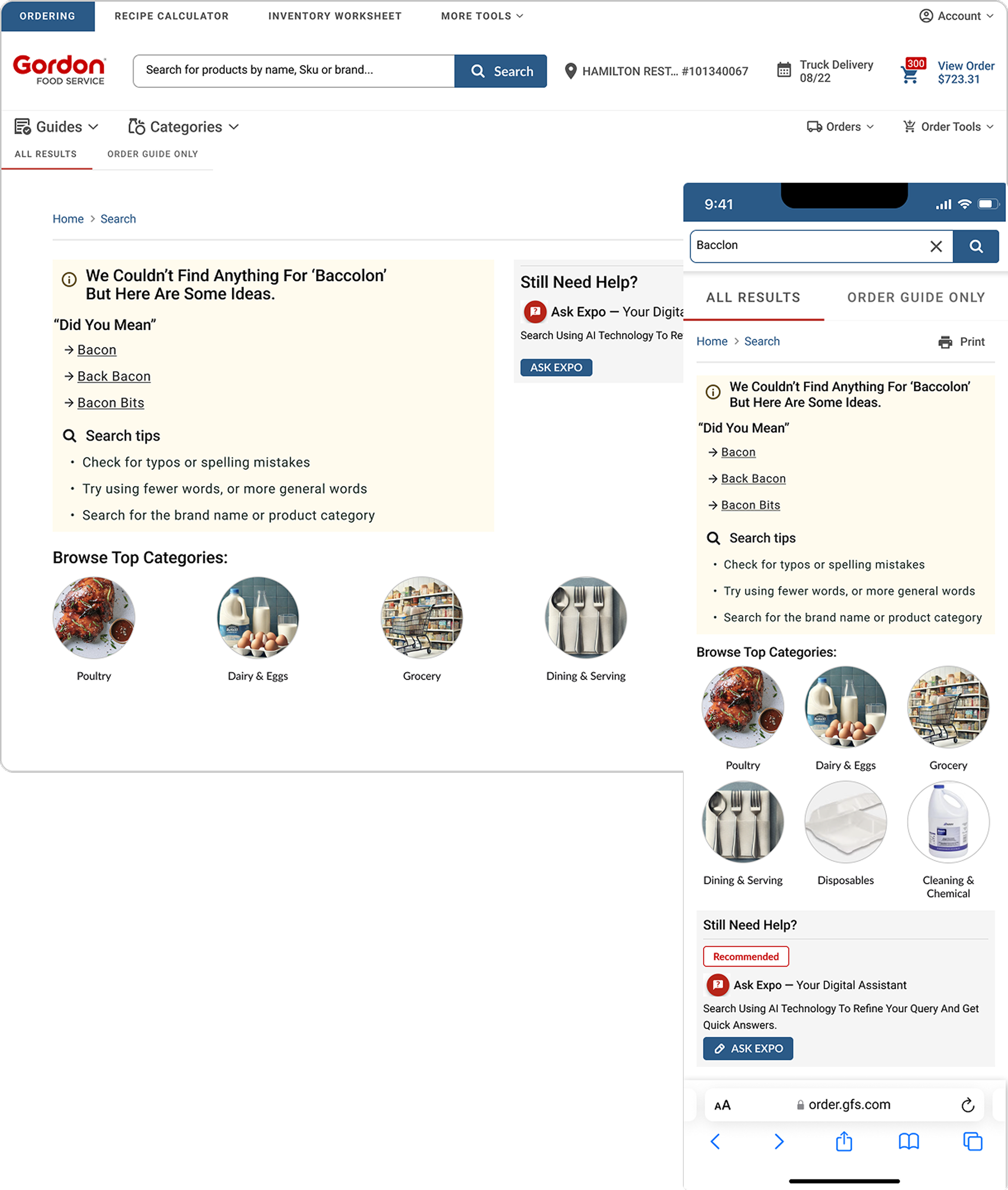
The legacy search experience suffered from:
• Low relevance and slow discovery
• High abandonment rates
• No support for typos, synonyms, or SKU variations
• Inconsistent UI and behaviors across devices
• Poor grouping logic and unclear hierarchy
Analytics, Baymard audit findings, and user interviews confirmed that power users — high-volume buyers — needed a much more efficient search experience to support repeat ordering.
The redesign process focused on identifying friction across the broader search ecosystem through research, workflow analysis, heuristic evaluation, and iterative exploration. I combined Baymard findings, support tickets, session recordings, and competitor analysis to better understand how users searched, recovered from errors, and navigated high-frequency ordering workflows.
• Reviewed support tickets and session recordings
• Conducted Baymard-based heuristic evaluation
• Analyzed competitor flows (Sysco, Amazon Business, Grainger)
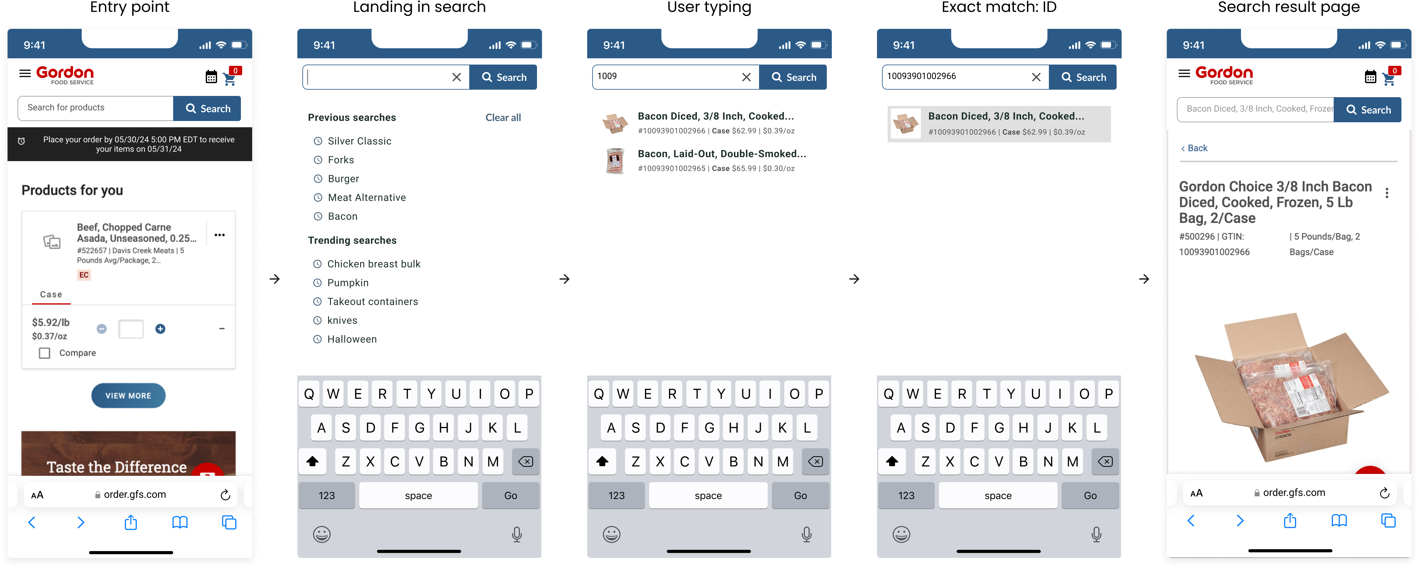
Mapped real ordering behaviors to ensure search could handle:
• Suggestive queries
• Exact matches
• No-results scenarios
• SKU-only inputs
Explored better autocomplete and recovery experiences focused on reducing friction during high frequency ordering workflows.
Search interactions were mapped across desktop and mobile experiences to better understand autocomplete behaviors, exact-match flows, recovery states, and repeat-order patterns. This helped identify high-impact discovery improvements and align search interactions across multiple ordering entry points.
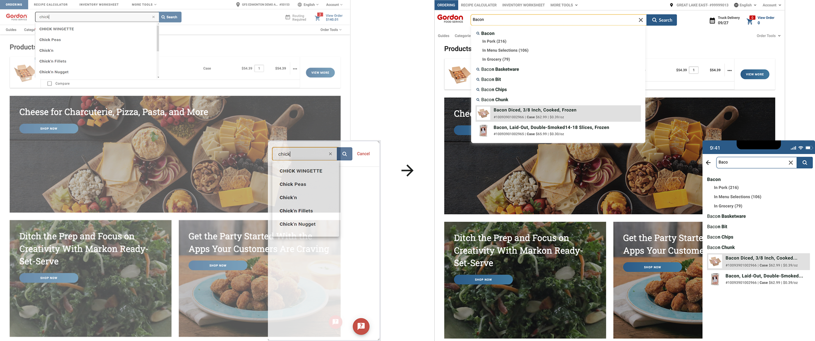
Designed for users who rely on common or repeat orders.
Behavior: smart suggestions, predictive typing, and personalized ranking.
Prioritizes fast navigation to a known SKU or product title.
Behavior: direct PDP navigation and grouped variations.
For power users who memorize SKUs.
Behavior: immediate ID recognition and keyboard-first interaction.
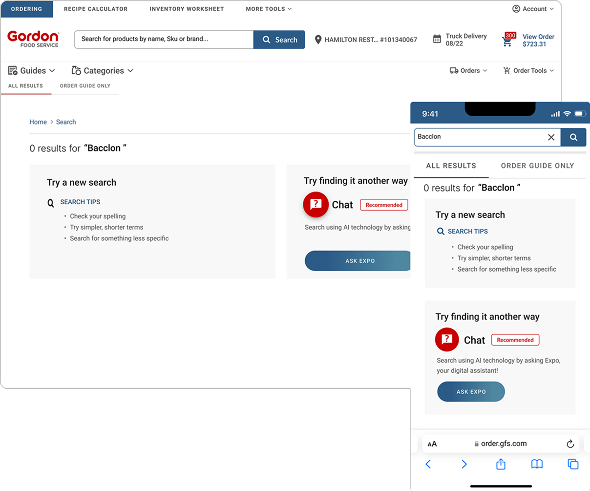
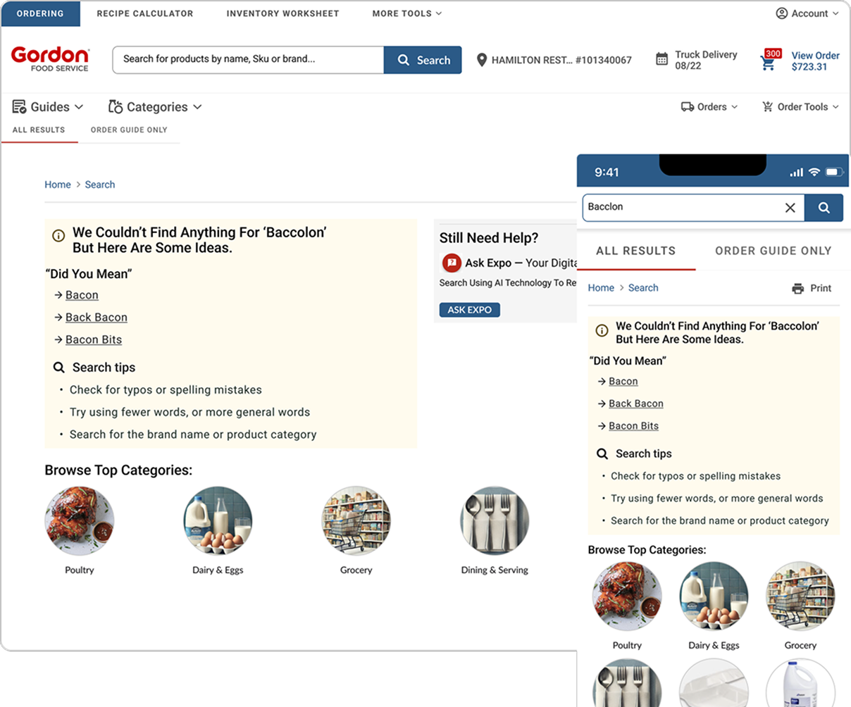
Redesigned to prevent dead ends.
Behavior: fallback suggestions, typo handling, category pivots, and clear recovery paths.
Explored autocomplete layouts and interaction states to improve scanability, product discovery, and query refinement across desktop and mobile ordering workflows. Iterations focused on reducing dead ends, improving recovery paths, and strengthening hierarchy across high-frequency search experiences.
Basic tips and category links. Feedback showed the experience still felt like a dead end.
Smart recovery, contextual suggestions, and typo handling reduced frustration and improved engagement.
Tasks included misspelled queries, filtering, SKU searches, and empty-state recovery.
Key Takeaways
• Search speed improved
• Suggestions felt more relevant
• Users recovered from “no results” faster
• Autocomplete hierarchy reduced cognitive load
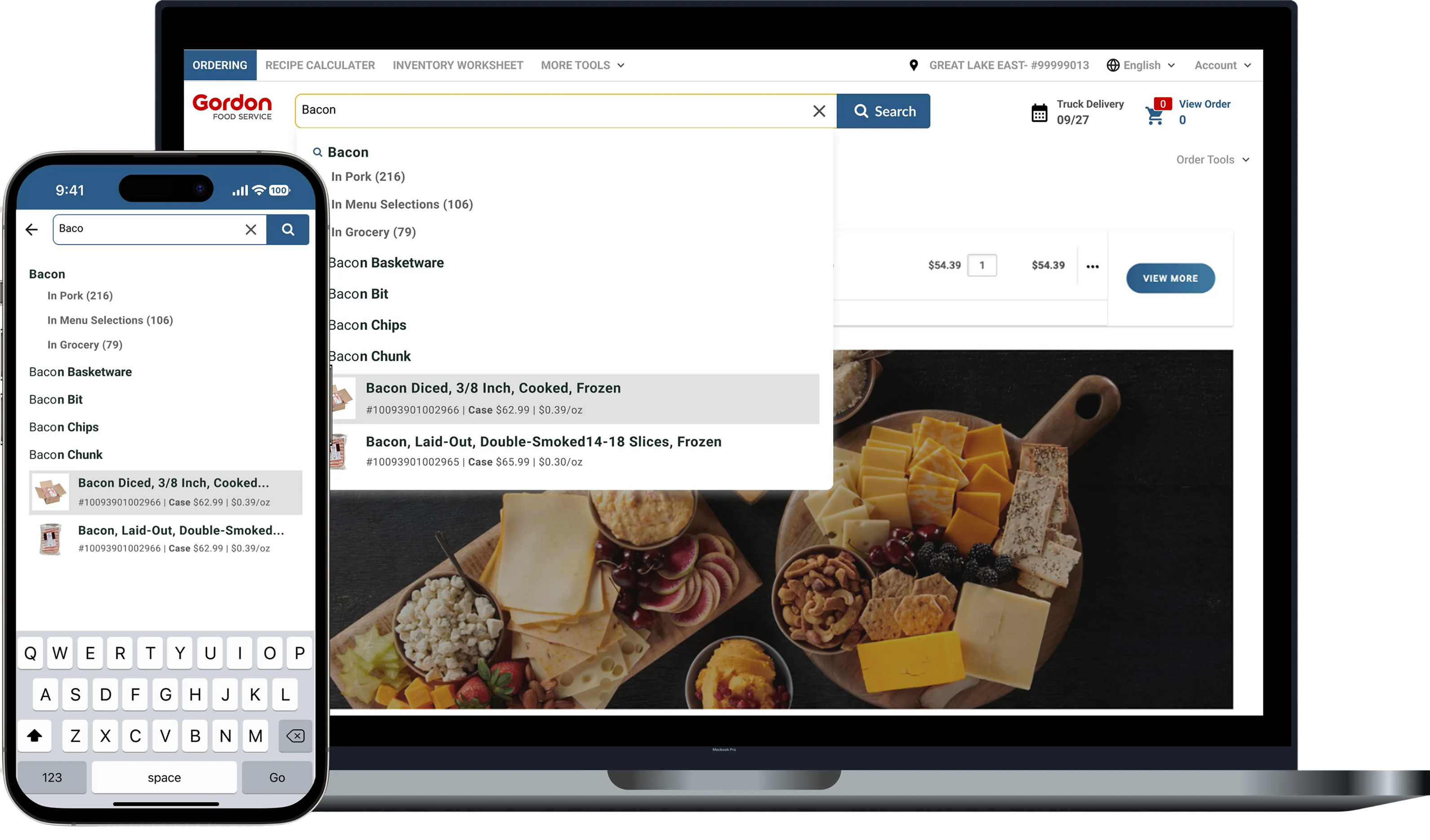
Improved Autocomplete
Clear grouping, headers, spacing tokens, focus states, and visual separation..
Smarter Query Handling
Supports typos, synonyms, exact matches, SKU logic, and intent detection.
No Results Recovery
Avoids dead ends, promotes discovery, and strengthens user trust.
Updated Layout + Hierarchy
Visually organizes suggestions by type for faster scanning.
The redesigned experience dramatically improves visual clarity, speed, and accuracy — especially for SKU-heavy workflows.
↑ 15 %
↓ 12 %
↑ 13 %
These improvements reduced friction in product discovery, increased conversion, and drove more efficient ordering for high-frequency B2B users.
%20(1).png)
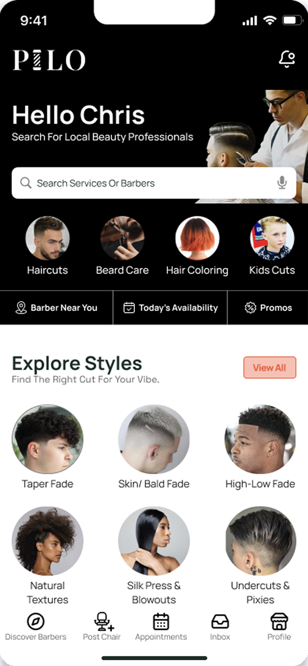
Pilo (Marketplace)
A mobile marketplace connecting licensed barbers with shops that need last-minute staffing.
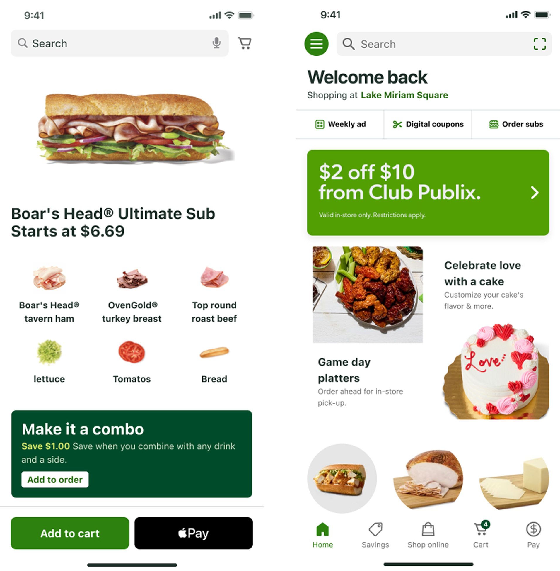
Publix (Grocery eCommerce)
A mobile-first cart redesign that increased engagement and simplified the checkout flow.
© 2026 Dandrew Merriweather | Designed + Built by Dandrew